The importance of Design Systems in Product Design
Design systems and style guides help organize product knowledge, the how’s and why’s, and centralize it. There are many companies that switched to using design systems on their products like Airbnb, Uber and IBM. By adhering to using a design system, a collection of repeatable components, and a set of rules guiding these components, these companies were able to change the pace of creation and innovation within their teams.
Here, at Mobiversal, being in the business of building mobile app products, from one end to another, after testing other approaches we concluded that using design systems in the creation and the design of a product drives to success.
What is a design system?
Design systems are the core or standards of any good app, as many like to say. They exist to give teams a consistent and reliable ecosystem for creating, adapting, and growing an app. As the app scales or new features are added, the design system grows with every change, leaving no interpretation in the development stage. Using a design system ensures consistency in the UI and the UX across design and development at any stage in the process of building an app.
The definition of a design system is a more mature and integrated workflow of its direct descendent, the graphic guidelines that businesses use to define their brand identity, voice, and tone across their products or services, social media, mass media exposure, advertising, stationery products for in-house or partner usage and even promotional products.
What are the contents of a design system?
A design system is a set of deliverables that contains style guides, components, guidelines, documentation, brand values, workflows, mindsets, and future plans for the app.
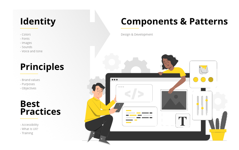
Style guides and pattern libraries, they might be called differently by every brand so that they meet their brand’s identity and language, but they hold the UI elements used in the app and the rules of integrating elements into the design and how to use them so that they meet the user’s needs.
Documentation is important for the whole team to understand how the app works, what are the specifications of the product and keep a changelog to help everyone stay in sync. A brand value and purpose document should help align the teams, making everyone understand why the product exists, how their jobs affect the product, and the product’s role in the end-user’s life.
Design principles are the guiding sentences that help teams keep a clear direction and focus on meaningful design decisions to reach the product’s purpose.
Brand identity and how it’s perceived must be defined in accordance with it’s strategy and objectives. A brand is composed of patterns and guidelines. Colors, fonts, paddings, icons, illustrations, etc., create the perceptual pattern of a brand, while the rules on how to use them ensure the guidelines for the correct combination of the brand’s language and recognizable identity across all its products, services, and platforms.
Combining the above subjects results in building components and patterns that will be used in a consistent experience across all platforms. Components have a specific functional behavior and are the building blocks of a design system, while patterns are their usage instructions in a logical and consistent manner.
Are there different types of design systems out there?
Design systems serve different meanings for every business, and these systems constantly evolve around the needs and purposes of the product/business.
Strict systems are comprehensive and fully synchronized with design and development; adding features and scaling the app must align with the system rules.
Loose systems provide flexibility for experimentation, and creative freedom, these systems being mainly created to serve as a framework for the overall design.
Modular systems are used for e-commerce, finance, and government websites. They’re created to have interchangeable and reusable components. It might be the most expensive system to realize, but it’s the easiest and fastest to adapt and scale by multiple users.
Integrated systems mainly serve showcases, marketing campaigns, portfolios, etc. Composed out of parts that are not interchangeable, these systems focus more on unique contexts.
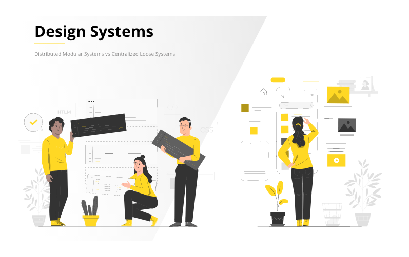
Centralized or distributed design system models?
Any of the four types of design systems we talked about above can be created in one of the following two ways:
Centralized, meaning only one team is responsible for creating and growing the system and ensuring that the other teams that work on the project meet most of their needs.
Distributed, where several users from different teams are responsible for the system. This approach makes the team more involved and more productive in growing the product, but it needs to have a product manager to keep the overall vision.
Be organized and conscious of the team’s needs.
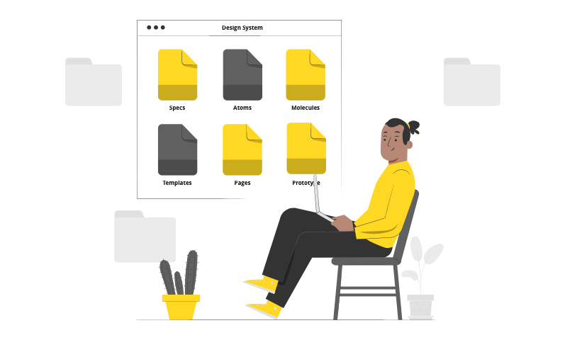
In Brad Frost’s methodology of Atomic Design, he talked about organizing a design system on levels: Atoms, Molecules, Organisms, Templates, and Pages.
- Atoms are the grounds from building the system: typography, colors, fonts, buttons, fields, labels, animations, etc.
- Molecules are groups of atoms, basic elements, that form the first level of a component.
- Organisms are groups of molecules that create components to serve as distinct sections of the design.
- Templates are organisms that start forming layouts. These can serve as a base of discussion with your clients. Templates can be upgraded to higher fidelity designs.
- Pages are specific instances of templates. Viewing everything in context allows you to see and fine-tune the whole atomic layer of your design system. This is the base for your final design of the app. Adding real content will render it close to the final and real thing.
You might want to check out Brad Frost’s methodology of Atomic Design for yourself, after reading this article, for a more comprehensive understanding of his methods.
But what design system should you build?
Creating a design system takes a bit of time and effort, so take the same approach to understand the needs of the client, teams, and the end-users. Establishing the type of a system is not a must from the beginning as it can change with time, but figuring out the system model is recommended from the beginning; not doing so might cause headaches if it needs changing.
With that in mind, mapping the UX through the user journey and analyzing the findings will align the team with the customer experience.
Creating a user experience from the start that guides you till the end without straying too far from the path gives a sense of accomplishment for everyone involved by experiencing it or seeing it play through, and it also provides critical insights and opportunities for future investments.
A good user journey inspires feelings.

To have a good user journey from the start, you have to ask the right questions. It might take some research to write all of them down, but here are a couple of questions to get you started:
- What actions does the user need to take to progress from one phase to the next?
- What are the barriers that stop the user from taking that action?
- What drives the user to care about your product?
Noting down every answer gives you a bigger picture of the user journey and highlights what might need special attention or change.
Making businesses understand that features are less important than human needs can sometimes be hard. However, analyzing the data from the user journey and translating it into relatable data while explaining the thought process can work miracles. It can help your client see the benefit of investing in something they might not even have thought about until that moment or what they disconsidered without consulting with the user data.
This brings you to the value system, where the end-user community’s needs and stories must be understood and considered for future investments.
Based on the above arguments, we all need to figure out which elements, components, and features should exist, and what helps or drags down the product.
What the future holds for design systems
Design systems grow more and more complex as the product and the businesses try to meet the needs of their users. Technologies and tools constantly evolve to add value, create low energy consumption and low friction environments for users.
We can create components, iterations, responsive elements, and layouts for different functions using these new tools at our disposal. Naming them according to their function and state helps in the long run both for design and for developers, as they can search for what they need at any moment.
Given the flexibility of some design systems, we can build and distribute modules that can easily be integrated into the workflows of other systems without spending too much money and time developing them from scratch.
What tools should you use?
If you got this far and want to start working, you might have already searched for “the best UI/ UX apps for building a product”, or “how to build a product” and stumbled upon numerous apps and tools for doing just that. But have you considered the question “which app should I use for my design system”?
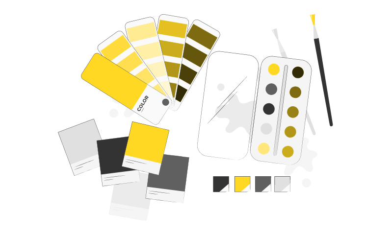
Well, we don’t have the answer for you, but we can help you figure it out with a couple of examples:
– Figma
Figma is one of the well-known platforms for designing and prototyping. It’s user-friendly, filled with features to help both beginners and experts, and also powerful and versatile with their desktop client and in-browser app. Sharing projects and prototypes is fast, easy and changes apply instantly. It’s free, but it also has a paid subscription that unlocks the full potential of the app.
– Adobe Experience Designer (Adobe XD)
XD comes as a free product from Adobe, but to take advantage of all the app’s features, you might consider getting a Adobe Creative Cloud subscription. The integration with all the other Adobe products like Photoshop and Illustrator is flawless, but sharing a document with others doesn’t come as a breeze as Figma made it feel.
– Sketch
Sketch is well-known across Mac users. It can be used for web design, graphic design, UI/ UX, icons, etc. It has most of Figma’s features, but it has a more limited approach regarding its animation and prototyping tools.
InVision Studio is a prototyping tool made by designers for designers. Lightweight and straightforward, it is an excellent alternative to Figma.
Examples of design systems
You have the notions and the app. Now, you want to see what others do. We’ve compiled a short list of design systems that we like; some of them have taught us brand-new things or showed us new ways of tackling a problem, while others simply helped us understand consecrated design choices of the big brands we all know.
– Material Design 3 – Google’s most expressive and adaptable design system.
– Human Interface Guidelines – Apple’s platform to seamlessly integrate UI resources for designing great apps.
– Atlassian Design System – end-to-end design language to create simple, intuitive, and beautiful experiences.
– Polaris – Shopify’s design system helps them work together to build great experiences for merchants.
– Carbon Design System – IBM’s open-source design system for products and digital experiences.
Conclusion
As we’ve seen, some of the biggest digital brands use design systems to scale, control multiple iterations of a product and create the best possible user experience. We cannot stress enough how approaching products in a design system manner has been a game-changer for us.
Whether you have a product already, or you are in the early stage of building one, get started by taking care of your product design system first. If you are not sure where to start from, Mobiversal has the expertise and the team to help you create a flawless design system for your product and more. Contact us today and get a free quote.
