7 Simple Steps To A Successful Launch Page
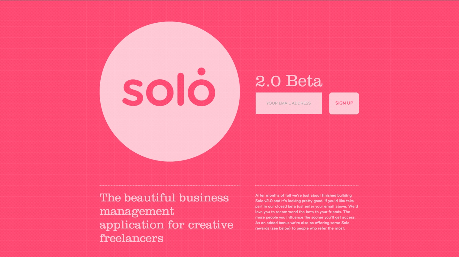
There are so many startups (over 156,000 projects just on Kickstarter) launching these days that you really can’t afford to waste any time, so while still coding on your phenomenal product, make sure you’re also building a list of potential users for your app. A landing or launch page allows you to attract and connect with early adopters who can turn into powerful brand ambassadors. You can choose from crafting a simple coming soon page or even a finished product page with full details, but whichever version you pick, make sure you pay attention to the below elements:
– Clearly define what problem you’re going to fix with your product. Let people know what you’re doing and don’t use abstract copy. You’ll probably test few version until you get to the one that converts the most customers.
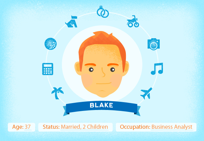
– Define your user personas. As defined by Wikipedia, personas are fictional characters created to represent the different user types that might use a site, brand, or product in a similar way. Understanding our customer’s needs helps us make important decisions in product development or while crafting marketing messages, ultimately leading to more conversions.
– Build an emotional connection with users. This can be done using a product video that demos the product while also telling a story about its users. Mailbox has done a good job highlighting new ways to improve email, or Spendee on how to easily track your expenses.
– Get people to subscribe by using a single call-to-action button. Your goal is to get people to leave their emails (yep just emails, no names or anything else), so above the fold avoid anything that might distract them, like links or other calls to action.
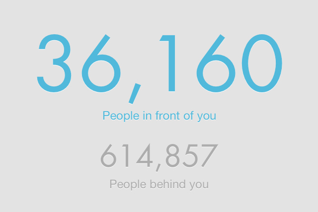
– Create exclusivity. Show off how awesome your new product will be, convince people that it will change their life and then make them feel they are part of an exclusive crowd. This technique was used in the past by the Mailbox team, who created a reservation system that showed the number of people before and after the person that signed up.
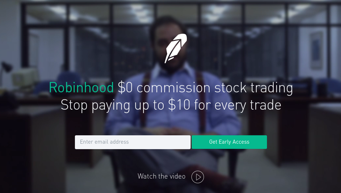
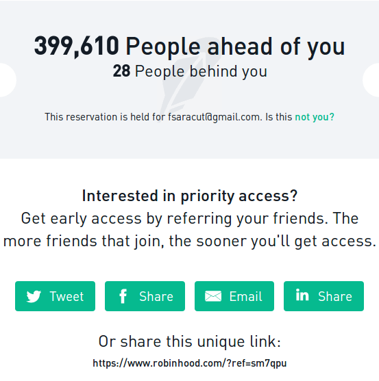
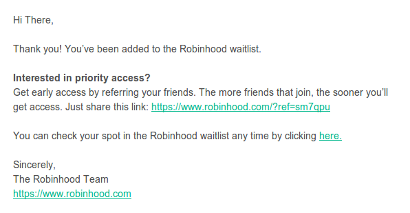
– Ask for shares and create a viral loop. The reservation system was used again by Robinhood.com, a stock brokerage related product. After having users signing up, they are encouraging them to refer the product to friends in order to get early access. This is nice and they are showing incredible results but some users might not fall for this, so you can think of other incentives like prizes, discounts or Pro accounts. Think wisely where your users are hanging out and only offer options to share on those places. If you’re building an app for kids, there’s no need to offer options to share it on LinkedIn.
– Re-engage users. People need to hear several times about your product before taking action so take any opportunity in the pre-launch period to build a relationship with them. Start with a thank-you email and then at least monthly update them on your progress.
– Provide a press kit. You shouldn’t rely only on users, while waiting for the launch make sure you are providing bloggers with everything they need in case they decide to write an article on you. So on your launch page place a link to a PressKit including mockups, screenshots, logo, icon and a pdf presentation. See here an example.
When it comes to developing it, you can choose from building it from the ground up, using a WordPress template or a service like LaunchRock, KickoffLabs, Unbounce, Lander or Instapage. Back to you now. Did you had any experience with launch pages? How did it work?
