5 Great Landing Pages for Mobile Apps
You’ve got a brilliant idea for an app and you’ve been working day and night to make available an MVP, but there’s one more thing you need before launch, an awesome landing page for your app. Landing pages go from one screen pages to full-blown websites, but since everything is built with a purpose, I’ll list below 3 things a landing page should do and then look at some examples:
– make users easily understand the problem the app is trying to solve and the solution
– show users how the app actually works before even installing it on their smartphones
– build trust that this is something worthy of trying
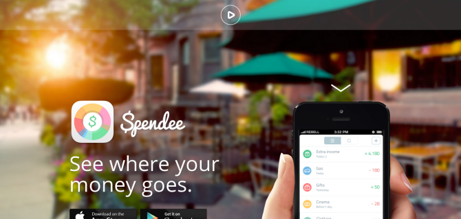
Spendee comes with the promise that it will let you easily track your expenses and on the homepage visitors can choose to watch a video to understand more, download the app or scroll to learn. I really loved the way they’ve connected the scrolling on the website with animations within the app.
iCalendar

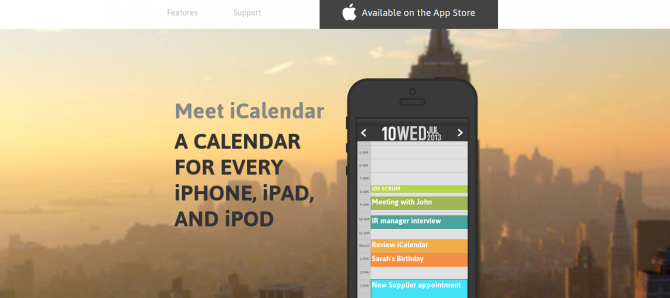
iCalendar is the iOS calendar on steroids. The landing pages is very colorful and nicely shows all advantages over the standard iOS calendar app. As you scroll down the menu stays on top and encourages visitors to download the app.
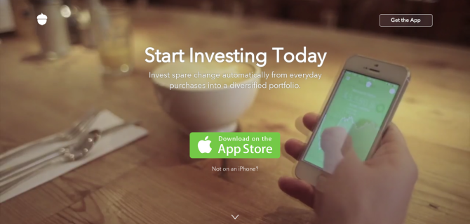
Similar with Trippeo, Accorns runs a video on the background and a very visible CTA to download the app. As a secondary CTA they are asking non-iPhone users to signup up for the Android and Web apps.
Paper

Facebook highlights the way Paper works using a slideshow, with each slide showing a specific functionality via a video. They are obviously putting an emphasis on user’s experience in Paper’s case.
Wanderworld

If you’re really creative you can turn your landing page into an elaborated story with nice graphics, like in the case of Wanderworld.io. As you scroll down you get to travel and experience the app in an engaging way.
I’m sure I’ve missed some great websites, so feel free to let me know about them in comments.


