Tips for Effective App Screenshots
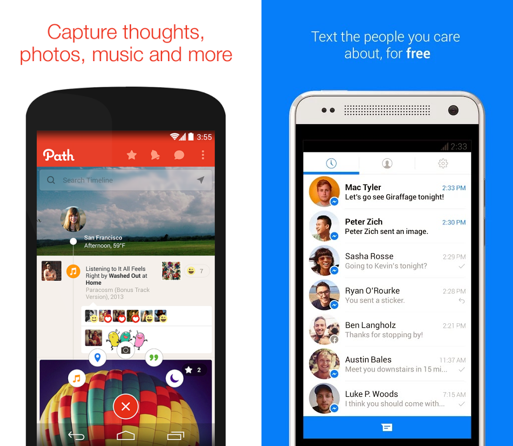
There’s so much noise nowadays on the app market that we need to look very careful at every aspect when marketing an app and screenshots are a very important element to pay attention to. When users browse through the App Store or Google Play, immediately after the icon and app’s name, they get in contact with the screenshots. I believe we need to look at screenshots like looking at a landing page, so the screenshots should tell the user a visual story but I think is also very useful to use a short descriptive message on each screenshot. If you thought summarizing everything to 140 characters on Twitter was hard, you’ll be challenged by preparing these texts. Make sure the font size is big enough so that it’s easy to read and you can also emphasize some keywords using bold. Here’s Path compared to Facebook Messenger.
Start with the most important feature or use case and then continue with other less notable features in the remaining screenshots.
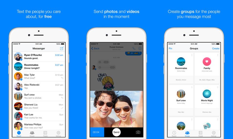 Depending on the type of app you’re promoting, you can get creative with the background and introduce other graphic elements, besides the descriptive message. Colored backgrounds tend to pop out and draw attention, so make use of them. For comparison here’s below Snapchat, Facebook Messenger, Path, and Typic.
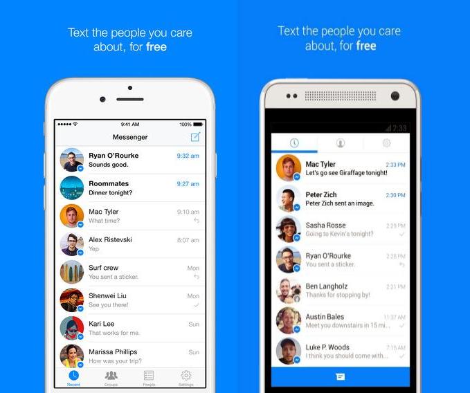
If you’re using a device, make sure to use the latest generation. Outdated devices can lead to thinking the app is outdated too. If we’re looking at Facebook Messenger’s screenshots, they use an iPhone 6 on the App Store, but an outdated version of HTC One on Google Play.
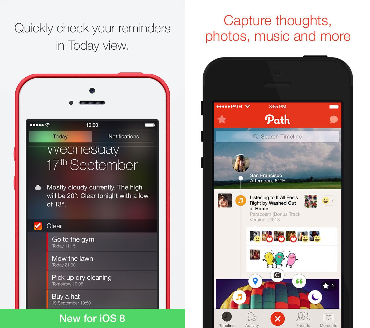
Another aspect that might be neglected is the status bar. Keep the same status bar on all screenshots and keep it clean. Use full signal and full battery, here’s how Clear and Path are using it.
That’s about it! I hope you’ll incorporate the above into your screenshots and improve the way you present your app. Are there other things that are working for you? Please let me know in comments.
