The Mobile App Design Process
This article is brought to you courtesy of Razvan Hosu, UI & UX designer with over 6+ years of experience at Mobiversal.
The design of an app boils down to two major elements, the UX and UI. Every design step gravitates around these two, and they are one of the most important elements that can make or break an application. This article will detail how UI and UX blend to complete the process of designing an app.
UX
UX stands for user experience: the experience that the user has when using the application. Practically, when you’re doing the UX design work, you design the mode in which the user interacts with the product and when and how you show him specific information in such a way that the user effortlessly understand how and what the app does.
A good UX is when the user always knows what actions need to be done in order to achieve his purpose as quickly as possible.
At this stage, as a designer you must read the specifications document. After properly analysing the specifications document, you can also have a meeting with the client in order to get the vibe of what the client wants to achieve with his product, while also figuring out questions such as what does the product represent and what real world problems does the product solve.
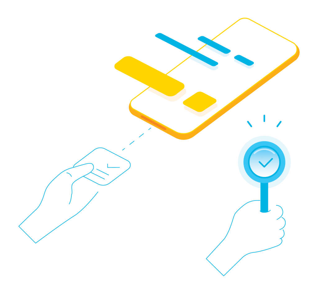
Thinking about UX
With the overview in hand, you get to work on the roadmap of the application, which basically illustrates when and how the user will get access to the different features of the app.
You first start with breaking the app into different modules, each module having its own main screen. Afterward, the modules get ordered after their nature and importance, in order to define the main screen and the specific elements of that screen.
The main screen is the most important screen in the app, which contains the core feature of the app, with which the user interacts the most and from where the user can access all the different screens of the app. Finally, you get to figure out the different features that will make the main screens.
Once you establish the roadmap you can go to the drawing board and start doing the wireframes, which basically are sketches of the user interface. Wireframes have the purpose of defining the importance-hierarchy of items on a screen and communicate what the items on that page should be, based on user needs.
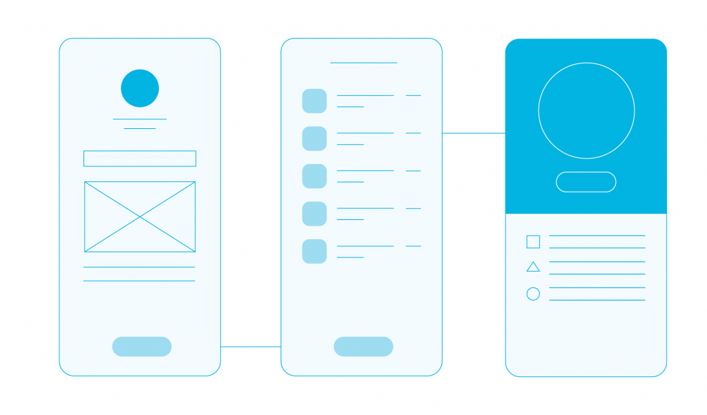
Wireframeing, illustrated
After the roadmap and the wireframes are done, you get to test your thinking for the first time on “unknowing test subjects”, by gauging the quality of their experience. If people find that some aspect of the wireframes is not intuitive, you need to go back to the drawing board (sometimes literally) and think of new ways to better the experience.
With the initial feedback of third parties in hand and updated wireframes, you forward the wireframes to the business analyst and the client for approval.
UI
UI, also known as user interface, gets to give life to the plain and dull-looking wireframes. When you start designing the UI you must keep in mind that the interface must be consistent with the branding of the product that you design for.
Based on the analysis you did on the UX, where you gauged the user persona, you then adapt the UI to the target market. One time we had an awesome project that involved building a music streaming app. After analyzing the target market (which consists of mostly 16 to 25-year-olds), it was clear that the theme of the app should inspire dark environments.
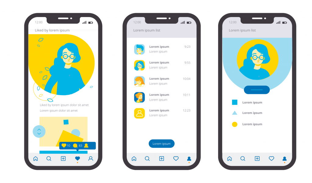
UI & UX, illustrated
The reasoning behind this is that teens and young adults between the ages of 16 and 25 that love music probably also like frequenting clubs and generally enjoy the nightlife. This process verges on the line between UI and UX, but we decided to mention it here.
Regarding UI aesthetics, there isn’t a lot to say; it depends on the inspiration of the designer that must tailor it tco the user’s needs and in some cases with the client’s preferences. Trying to keep up to date with the latest design trends is an invaluable asset and a reference point for your future design efforts.
As for the technical-side, if you don’t have enough confidence in the feasibility of your UI, don’t forget to check in with a technical person (developer) so as to see if your design is do-able.
Real-world user validation of your design

Design validation
After the product is officially launched, you then await your first real-world usage impression and you will find out if your design works as expected. In off-chance that something goes wrong, there are generally two major outcomes that come from your design being improper. These two outcomes are evenly divided between the UI and UX.
Firstly, you need to find out which one of the two is the problem. If the UI is nice users get a good first impression, but after they get to play around a bit with the application and find out that the overall UX takes time to get the hang of it or they get frustrated, they will uninstall the app as quick as 1-2-3.
On the other hand, if the UX is great but users do not like or don’t even get to try the app because it’s not appealing to them, then you get the same results, as in people leaving your ecosystem. UX and UI need to exist symbiotically, where one takes advantage of the other, building on top of each other. Generally, though, bad UX is marginally worse than bad UI.
In conclusion, the most important thing is to have your research properly done, in order for your design to accurately portray the user’s needs. If the research is comprehensive and accurate, you have at your disposal almost everything you need to design a great product for your users.
