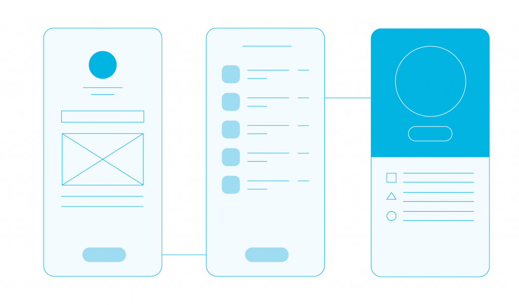
The Value of Wireframes

Could a house be built without an architect’s plans? It probably could. Would you feel at ease living in such a house? You probably wouldn’t.
So why then do some product managers / business analysts / insert your position of choice here, decide there is no need for wireframes when developing an application? How is it different from not having sketches for a house that you wish to build?
Sure you might say, you won’t have the app collapse and kill you. But it could have a devastating effect on your budget and estimates, which might rival fighting under debris for your life. Nah, I’m just kidding.
But in all seriousness, you should think about constructing wireframes early on in your development process, as they can save you time, money and ultimately success.
At Mobiversal, we had a period of fine-tuning our development processes. In some instances, we decided there was no need for wireframes and we went with that decision. In others, we felt they were necessary, not only to paint an accurate picture in our client’s head but also for our own development teams.
In short, we’re not saying that wireframes are a must, but that they are highly encouraged, especially for larger apps with many screens and various instances.
So, what’s a wireframe?

Basically, wireframes are preliminary sketches that show a blueprint of the final design. Imagine a screen, but sketched out and without the main illustrations (UI elements) on it. Added up, these wireframes tell the story of the application.
To better put them in perspective, we’re going to continue with our house example using an analogy we’ve taken from our book:
Populating the living space inside the house can be thought of as the wireframes, the positioning of all the furniture and items within it (basically the process of interior design).
Why should you hassle with wireframes?
Creating mental images based on dry specifications documents is not an easy feat. Up until recently, we first wrote the specifications which were then approved by the client. Afterward, one of our UX/UI designers started designing the application based on the approved specifications document.
Now we bring in the UX/UI designer together with the business analyst when creating the specifications document, together with the wireframes. As a side note Marty Cagan, in Inspired, stressed the importance of having your product manager work hand in hand with the designer from the beginning:
The designer works closely with the product manager to discover the blend of requirements and design that meet the needs of the user
In our case, the product manager role is fulfilled by the business analyst.
Better and faster understanding

If you don’t have reasonably developed visual and spatial abilities (or you’re not familiar with apps or the topic at hand at all), it’s hard to envision what those functional specifications would look like in actuality.
That’s where wireframes come in. A study made by Eliza Bobek of the University of Massachusetts and Barbara Tversky of Stanford University found out that creating visual explanations helps students improve their learning abilities.
Their study focused on two STEM experiments, one mechanical (a bicycle pump) and one chemical (bonding). Creating a visual explanation was superior and benefitted participants of both high and low spatial ability. As mentioned by the two scientists:
The benefits should generalize to other domains like the social sciences, history, and archeology where important information can be visualized.
We agree.
Being visual creatures, it helps to visualize what is being talked or written. That’s why we want to stress the importance of creating wireframes.
We had times when clients (especially the non-technical ones) felt overwhelmed by mammoth-like 100+ pages specifications. And there’s no shame in admitting that; even our business analysts, designers, and developers feel that sometimes it’s hard to juggle in mind dryly written concepts.

Wireframes provide a better avenue for imagining what the application will do. Keep in mind, you still imagine as you go through the wireframes user journey, but at a much lesser degree than working only with documents.
Cognitive load is much more suppressed, and the sketched screens can better link in a stakeholder’s mind, emptying up space for creative thinking.
Now that we’ve touched on the theoretical and psychological levels, let’s head on to something more pragmatic.
Better time-investment
From our experience, deciding to build wireframes first and then going full steam ahead with the rest of the design, has been the better investment from a time standpoint.
Even if time-savings were marginal, stakeholders were always more at ease and satisfied by having wireframes.
Keep in mind, one of the purposes of wireframes is to mitigate risk. From the client’s perspective, it’s lessening the surprise of seeing the design (with the roadmap & user journey) all done, without having the time to influence it or to properly acknowledge it.
From the designer & business analyst’s perspective, it’s important to make sure that the features harmonize with the UX before heading on to the last touches of design.
From what we’ve observed, wireframes do not necessarily gain you time in the overall development of the application (although they mostly do, marginally), but they gain you peace of mind.
And stakeholders love peace of mind, be they developers, clients, designers and whatnot.
Less back-tracking

Imagine skipping over wireframes and heading over to designing an application from scratch to finish.
You’re bound to back-track and add some buttons over here, a dropdown over there, fix the padding below to accommodate the new navigation bar you’ve decided upon, etc.
Sure you might say, a good UX designer should not back-track. Well, maybe a perfect one shouldn’t, but it’s impossible to not do it at all on your decisions.
That’s where wireframes come in. They provide a better risk mitigation strategy, by sketching out the screens and the user journey of the application beforehand.
This way, there is enough time to play and decide on the would-be structure and UX of the final design, without being too advanced in the process.
TL;DR: Consider using wireframes, as they can be a valuable asset in the process of developing your product.
Illustrations used in this article courtesy of Cristina Hosu, illustrator of From A to App Success: How to turn ideas into apps that make a difference.


