Dark Patterns – Roach motel. Sneak into basket
PART VI
Today is our penultimate stop into the opaque and immoral world of dark patterns. Tune in to learn more about the Roach motel and Sneak into basket dark patterns.
What is Roach Motel dark pattern?

The roach motel design is a dark pattern that makes it difficult to leave once you’re in. An example of this would be having trouble unsubscribing from a service or mailing list after signing up for them the first time around, which was easy to do when they were introduced.
Nobody likes roaches. Not even roaches like roaches. They get through every nook and cranny and find their place inside any home, to the bewilderment of the owner.
As easy as they get in, as hard it is for them to be forced out – if quantified it would probably be almost inversely proportional. As some people might know, cheap motels are usually swarming in roaches, hence the name for this type of dark pattern, roach motel.
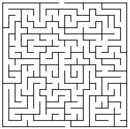
The philosophy of the roach motel pattern is to make it extremely easy for users to get onboard of certain situations/services, but hard to get out. An analogy for a roach motel can be considered the classic maze (Fig. 1). Entering a maze is easy, but finding the right path out (usually only one) is much more difficult.
The difference is that finding the exit can be considered one of the main purposes and what makes a great maze, while a roach motel is merely a tactic used by services to keep users in.
Making a maze more difficult can be great and neutral from an ethical standpoint, but purposefully crafting a more devious roach motel pattern to bound users to a certain situation/service is not.
The most common use of a roach motel pattern is when trying to cancel a subscription, downgrade a subscription, deactivate/delete an account or unsubscribe from a mailing list.
One of the main objectives of services/apps is trying to maximize existing user retention, thus applying different tactics in order to make it harder for the users to act in any way counter to the aims of the services. Best way to avoid dark patterns while maximizing user retention is to have you app design by professionals. Mobiversal offers ui/ux design for mobile apps and consultancy to improve your app’s design and user retention.
Of course, it is in the interest of companies to try to, at least, maintain the current status quo with their existing users, but this can lead to the extreme.
An example of a roach motel dark pattern happens while trying to cancel a file hosting service’s Professional Trial. The process unfolds like so:
- The first step starts with clicking the Cancel Trial button, which is using white as its primary color (most pro-business buttons that the file hosting service uses are colored in blue, which is a more enticing color for users to click on)
- After clicking the button, the user is greeted with a new page, containing information about downgrading to the Basic plan. As the user scrolls the page, the service continues to emphasize the downsides of downgrading, such as losing space and access to different features. At the bottom of the page, the user is presented with 3 buttons and a hyperlink. Two of the buttons (colored in blue) and the hyperlink, positioned so as to be in the center, towards the focal point of the user, regarding keeping the current state of the user’s subscription. The third button (colored in white), is de-emphasized.
- After clicking the white button (“I still want to upgrade”), we reach a third page, which contains a survey from the file hosting service, asking for the reason why the user wants to downgrade. At the bottom of the page, the user is presented with two buttons, one (colored in blue) to keep using the current subscription, and one (colored in white) in order to continue with the canceling process.
- After clicking continue, the user reaches a fourth page, in which he is presented with more information about what features would be lost if downgrading (the same tactic as in step 2, used to persuade the user to cease the process). At the bottom of the page, the user has an option to choose between 2 buttons, one (colored in blue) to keep using the same subscription, and another (colored in white) to downgrade.
- Finally, after clicking the downgrade button, the user ultimately reaches the end of the process, having his account downgraded.

As you can see, there is a certain amount of tediousness in this process, where the user gets bombarded with multiple dark patterns, not only the roach motel but also:
- confirmshaming – repeatedly informing him of the features he will lose, using custom buttons to try to nudge the user into avoiding them
- misdirection – purposefully de-emphasizing options hurtful to the service, such as using a blander chromatic for downgrading buttons, white, as opposed to options that are at least neutral but usually beneficial to the business, which use the blue color
Mobiversal’s advice:
- User retention maximization is an important tactic for business, and its necessity cannot be debated. But, in order to reach a silver lining between maximizing user retention and not falling into the roach motel dark pattern, one thing trumps all: common sense.
- As we have seen from the file hosting service example, in order to downgrade or to cancel, there are 5 steps involved AFTER clicking the cancel button.
- Our suggestion is that, in order to not be intrusive and to leave the user with a good impression, you need to have at the most 2 more steps, but realistically, 2 is kind of pushing it.
- Optimally, in order to reconcile both the service’s objective of user retention and the user’s objective of following through with the process, there should be only one more step before completing the process.
- In this follow-up step, the user should be presented with all the benefits that he will lose if he follows with the process (as perfectly issued by the file-hosting service in the second step of the example, but again intrusively in the 4th step, which already was located deep in the dark pattern realm). In addition to this, there should be a final call to action, which needs to present the user with the two options: keeping his current level of interaction with the service (maximizing business objectives) or canceling/downgrading the level (maximizing user objectives).
- The service/business should strive towards trying to merge these two into one so that the user’s objective should be indistinguishable from the service’s.
Sneak into Basket
One of the “advantages” of being a parent, some people may notice, is having your children put things into the basket without the knowledge of the parent. At checkout, the parent is surprised with a few new additions on the conveyor belt.
You may be astonished to find out that children are not the only people practicing this cunning, and sometimes highly effective, method. Businesses and services often sneak into basket items to which you have not given your accord.
Usually, this type of dark pattern ensues when services try to further add to their revenues from a user, either by automatically adding an item to their purchase list (Fig. 2), or by adding an opt-in checkbox for users that are automatically checked by the service, and the user has to manually uncheck it.
This type of dark pattern can be coupled with another one, mainly confirmshaming, under the form of a donation that the user can make towards charities.

Mobiversal’s advice:
- Sneak into basket in the form described above should be avoided at all costs, as it is a dark pattern that quickly elicits negative reactions from users.
- An altered version of this dark pattern, which basically disqualifies it as a dark pattern, is asking users if they would like to take into consideration this additional product while providing them with an opt-in checkbox which is not automatically checked. This can be considered the humane and user-oriented sneak into basket version, an anti-dark pattern, which tries to meet the objective of the service, and can also meet an unknown need of the user (for example, computer insurance for enterprise solutions).
This sums up our penultimate stop into the journey of dark patterns. Join us next time for our conclusion on the subject of dark patterns.
- Part I – Introduction
- Part II – Confirmshaming
- Part III – Disguised ads & Forced continuity
- Part IV – Friend Spam & Hidden Costs
- Part V – Misdirection, Price Comparison Prevention & Privacy Zuckering
- Part VI – Roach motel & Sneak into basket
- Part VII – Trick questions & Fake new notifications