Dark Patterns – Friend Spam & Hidden Costs
PART IV
With the fourth part of our journey into the world of dark patterns, we get to delve deeper by learning about the Friend Spam and Hidden Costs patterns.
Friend Spam
Spamming has started being practiced not long after the invention of email. ARPANET provided the medium for the first email considered spam to propagate, in 1978, which contained the advertising of a new model of Digital Equipment Corporation computer. The email was sent to 393 unknowing recipients.
Friend spam is a type of dark pattern, in which a service asks for the email or social media permission of a user, the request being marketed as a benefit for the user.
After receiving said privilege, the service starts emailing or messaging spam promoting their business to the contacts based on the email address or social media account.
The biggest downside for the user is that the service sends spam to all of his contacts, claiming that it is personally sent by the user, which can escalate into the existing friends/contacts disassociating from the user, which may in turn pivot the user against the service. This creates a vicious cycle to the detriment of every party involved.
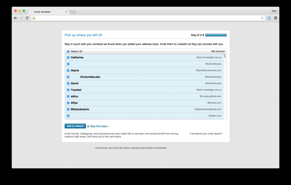
A popular business social media platform was fined $13 million dollars in 2015 for succumbing to such practices, following a class-action lawsuit. By clicking the Add to Network button (Fig. 1), the user would agree, unknowingly, to permitting the social media to spam the user’s contact list with messages signed with the user’s name.

Mobiversal’s advice:
- Do not send emails on behalf of a user, instead try to market them as being personally written towards the users by you (the service)
Hidden Costs
Nobody likes extra costs. But you know what beats extra costs? Hidden costs.
They usually represent a way in which services reveal extra costs as close to the purchasing moment as possible. Arriving at the last step before finishing the transaction, the user is usually too invested in the process of acquisition, which included spending a certain amount of time entering all of his personal and billing information.
Thus, the probability of accepting added (previously hidden) costs, is much higher. This is what services/businesses sometimes bet on.
This can be considered an adapted form of the Sunken Cost Fallacy, meaning that a certain amount of cost (in our case, effort) has been already incurred, and the process of stopping the process is much more emotionally unpleasant than continuing.
Basically, the user has already spent a lot of effort in entering all of the necessary information, navigating through the steps (or pages/screens) and finally arriving at the last step, to throw it all away for an extra (previously hidden) cost.
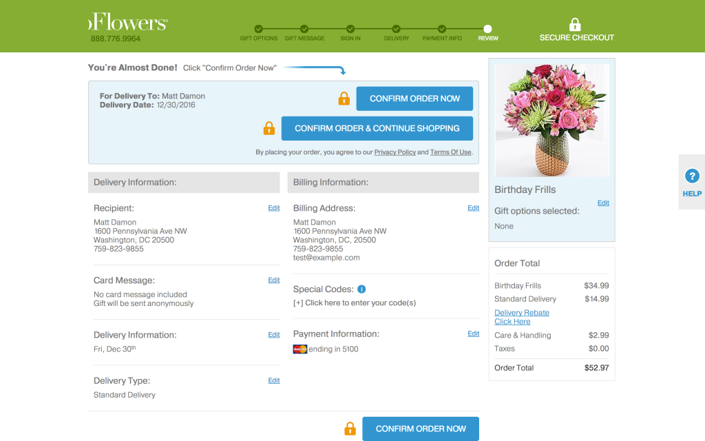
An example of a business practicing this dark pattern is the flower retailer from figure 2. Hidden costs are revealed in the last step of the purchasing process before the user actually confirms the order.

In the same manner, some services can add a variety of hidden costs, such as maintenance fees, warranty, and others.
Mobiversal’s advice:
- Do not have your service add any hidden costs to a user’s purchase; instead, present them with the opportunity of doing it themselves, if desired
- Try to not structure your suggestion under the guise of false social proof, so that users do not feel peer-pressure to purchase the additional item or service (i.e. do not use phrasing and UX such as “People also frequently bought <item x> with your item!” or “Items frequently bought together”)
That sums it up for this week. Join us next time, when we get to learn more about Misdirection and Price Comparison Prevention.
- Part I – Introduction
- Part II – Confirmshaming
- Part III – Disguised ads & Forced continuity
- Part IV – Friend Spam & Hidden Costs
- Part V – Misdirection, Price Comparison Prevention & Privacy Zuckering
- Part VI – Roach motel & Sneak into basket
- Part VII – Trick questions & Fake new notifications


