Dark Patterns – Confirmshaming

Part II
Welcome to part II of our journey into the world of dark patterns. Today’s stop is the pattern known as Confirmshaming (or guilt-tripping).
This type of dark pattern, as the name might suggest, shames users in confirming to opt for something. The user is guilted into succumbing to the service’s desired action. This type of pattern can be considered a form of emotional abuse, depending on the intensity of the shaming applied or the type of objects/ideas used in the shaming.
By targeting the emotions of the users, companies increase their chances of nudging users into acting not in the user’s interest, but in accordance to the objectives of the company.
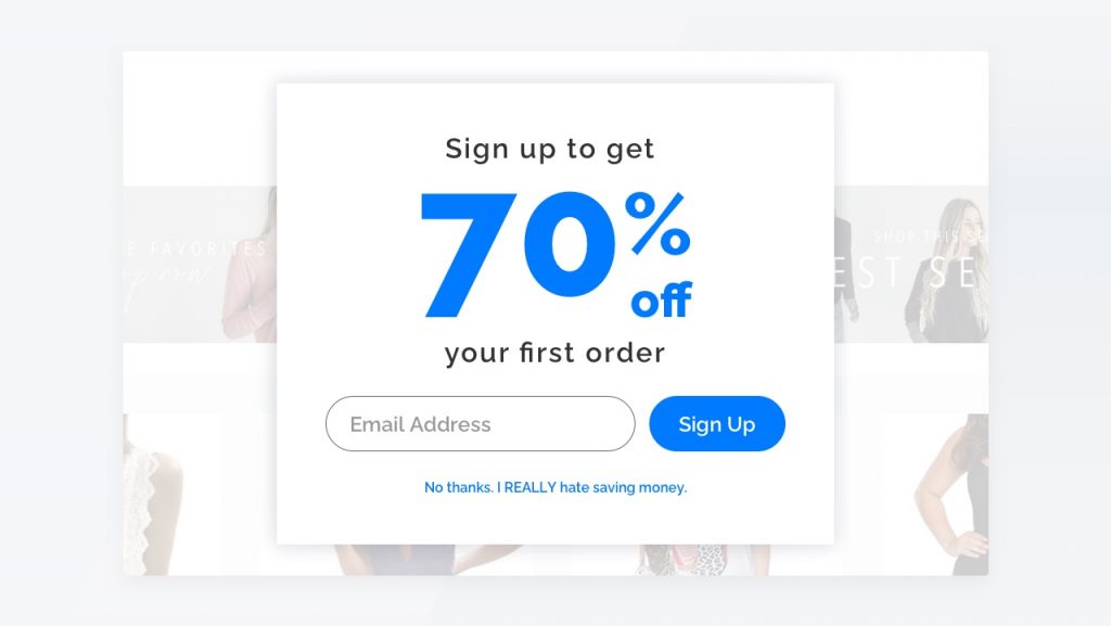
As probably implied, usually confirmshaming dark patterns are used with marketing mediums, such as asking users to provide their e-mail address in order to receive a weekly newsletter, when trying to cancel a subscription to a service or when asking users to financially support a service. Not only this, but usually the cancel option is not on an equal footing as the accept option: this can range from using a different font size to using a whole different type of style on the button, making it much less visually appealing.
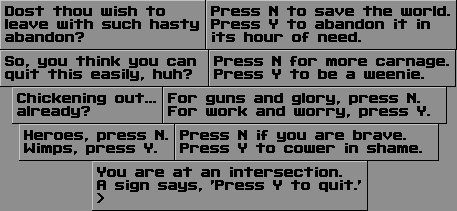
The confirmshaming spectrum ranges from producing mild guilt trips (Fig. 2) to severe ones, oriented towards emotional abuse (Fig. 2). This usually depends on the subjectivity of the user that engages with such a pattern, as patterns that look mild to some, might exercise a higher dose of emotional trauma to others. A psychological downside is offloading mental effort on the user, under the form of cognitive dissonance (dealing with two conflicting ideas).This might manifest with putting the user in a situation with personally conflicting options, which can increase mental and emotional stress (e.g. “I do not want to subscribe to this offer, but if I do not, it says that I am a bad person, which can lower my self-esteem”).
Some confirmshaming tactics do not necessarily need to provide explicit shaming in order to guilt users into confirming; they can also just provide an undesirable outcome by not deciding to subscribe (Fig. 3). The sky is the limit, in terms of the creativity that can be used when crafting this type of dark pattern.


Surprisingly (or not), confirmshaming in IT is not a new concept, as proven by the a video-game (Fig. 3), which was launched in May of 1992.

In summary, confirmshaming patterns are tactics that appeal to the underlying psychology of human nature, with the purpose of eliciting a positive response from users through shame and guilt. The downside of this tactic is self-evident, not only alienating users and reducing the desired conversion rate of users (caused by the subtle attack on their beliefs and values) but also by tainting the reputation of the initiator (the business).
Mobiversal’s advice:
- Keep your choice of words as unbiased as possible
- If keeping your choice of words as unbiased as possible conflicts with the general feel and vibe of the service, some artistic leeway can be deemed acceptable, in order to maintain the effect (e.g. Fig. 3)
That’s it for Confirmshaming. Guilt is a strong emotion in us humans, and we hope that UX designers will stay away from any effort of guilt-inducing interfaces. Join us next time to help us uncover a new type of dark patterns, Disguised Ads.
- Part I – Introduction
- Part II – Confirmshaming
- Part III – Disguised ads & Forced continuity
- Part IV – Friend Spam & Hidden Costs
- Part V – Misdirection, Price Comparison Prevention & Privacy Zuckering
- Part VI – Roach motel & Sneak into basket
- Part VII – Trick questions & Fake new notifications


