Dark Patterns – Misdirection. Price Comparison Prevention and Privacy Zuckering
PART V
Because it has been a while since our last post on Dark Patterns, today we’re continuing our journey into the realm of bad and unorthodox UX with three patterns: Misdirection, Price Comparison Prevention and Privacy Zuckering.
Misdirection

Watch out for Ms. Direction or you’ll get fooled. She can easily hide the truth from you.
Wordplay aside, the misdirection dark pattern is a tactic used by services to divert the attention of the user from something important, confusing him or her with unclear choices or promoting other brands of the same company.
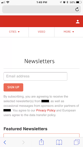
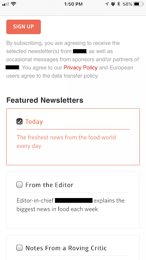
A good example is about a food and dining network of sites (Fig. 1 and 2), which contains the option to sign up for other “Featured Newsletters” of the same company.

Fig.1 – Signing-up to the Newsletters 
Fig. 2 – “Featured Newsletters”
Mobiversal’s advice:
- While trying to market one of your services towards the users of another one of your services is not inherently bad, try to envelop the wording in an honest way
- Do not market your other service as being a project made by a different company which you endorse, but profit on the existing experience and established user base of your other service
- Make sure to present the other services as being part of a family of software suite
- Try to market the service in a non-intrusive way
Price Comparison Prevention

Human advancement has been achieved in no small measure by always seeking the better deal, whether in terms of finding the most nutritious food with the least amount of effort by hunter-gatherers in prehistoric times or finding the most suitable software that meets or exceeds the needs of users.
In order to happily satisfy a savvy user, a comparison needs to be done to gauge which software can bring the most bang for the buck.
If you or your product are not the best on the market, chances are after a price comparison, you will not be on the profitable side of the analysis.
This is why some services/companies are not that confident in letting users freely and easily do price comparisons, which in turn leads to creating the price comparison prevention (PCP) dark pattern.
This dark pattern is usually used by retailers to obscure a direct price comparison between items, as exemplified by a chain of supermarkets in the UK (Fig. 3), where the first and the second item cannot be directly compared (by items or kilograms).
Mobiversal’s advice:
- Display the same unit of pricing for different items of the same category, regardless of the form in which they come (bulk, individual, etc.). This also applies to in-app products.
- Make those options as visible as possible, without requiring much (or no) interaction from the user’s part.
Privacy Zuckering

Mark Zuckerberg is widely considered one of the most successful dropouts turned entrepreneurs that the world has ever seen, alongside people like Steve Jobs and Bill Gates.
Facebook is, at the time of this writing, not only Zuckerberg’s most influential project but also the largest social media platform and the fifth most successful company in the world, with a net market cap of $411 billion. Certainly, a lot can be said about Mark Zuckerberg, but his entrepreneurship prowess cannot be denied.
Although Facebook’s rising value is attributed to a smart, but not flawless, business logic, some issues regarding privacy have slowly started to fester, culminating with the Cambridge Analytica scandal.
In early 2018, it was revealed that Cambridge Analytica was harvesting personal data from the profiles of users, without their consent, in order to use it for furthering political interests.
The questionable practices of companies such as Facebook have given rise to better regulations for tech companies such as the GDPR in Europe, and overall a better awareness of the importance of privacy by users.

In an “anti-homage” towards these practices, a dark pattern has been named after the founder of Facebook, privacy zuckering. A play on words, “zuckering” is derived from “suckering”, meaning that someone is “suckered” (i.e. fooled) into something.
Thus, privacy zuckering, means getting fooled into giving your privacy away, sharing more information about yourself than originally intended, without your knowledge.
This is achieved by the service not being explicit in what privacy measures the users are signing for, obscuring ways in which to control different privacy settings (or hiding or not having them altogether), combining it with the ability to easily “overshare” personal information.
Privacy zuckering is a tactic that takes place mostly behind the scenes. By having a complex and often obscure Terms and Conditions and Privacy Policies, users get “zuckered” into giving away their information towards different data brokerage industries, through a third party (usually involving a service, such as Facebook).
Most of the time, based on how some of these documents are currently structured and worded, users would need a legal office with them in order to decipher all the word salad and terminologies used.
Mobiversal’s advice:
- Subtly nudge users into carefully reading the Terms and Conditions and Privacy Policies before accepting to use your service. This can be done through a number of different UX decisions, such as
- Using specific wording to suggest to users how important the Terms and Conditions and, especially the Privacy Policy, are (e.g. “Please make sure you have read the T&C and PP”)
- Making it mandatory for users to scroll through the documents in order to proceed to the next step (creating the account or something else)
- Note: Making this objective a primary one in the process of conducting business, a conflict may arise when trying to maximize user retention, as compelling users to first scroll through the legal documents may reduce your user conversion rate.
- Providing the documents in a visible and easy to reach position on your landing page
- Write your Terms and Condition and Privacy Policy with clear and concise terms, and try to avoid as possible any overly useless legal wording, in order to make it as easy as possible to understand the documents
- If conducting business in the EU, make sure to proof your service to be GDPR compliant
- Do not store any unnecessary personal information, only the essentials to ensure the necessities of running your service
- Be privacy-oriented by design – meaning that you should place the user’s privacy in your top objectives when conducting business
- Update your legal documents as frequently as needed
Join us next time for our penultimate journey stop, to learn more about the Roach motel and Sneak into Basket dark patterns.
- Part I – Introduction
- Part II – Confirmshaming
- Part III – Disguised ads & Forced continuity
- Part IV – Friend Spam & Hidden Costs
- Part V – Misdirection, Price Comparison Prevention & Privacy Zuckering
- Part VI – Roach motel & Sneak into basket
- Part VII – Trick questions & Fake new notifications


