Dark Patterns – Trick questions
PART VII
Today marks the end of our journey into the murky world of dark patterns. Even though dark patterns are continually evolving and emerging, today we’re gonna wrap up the series and learn about Trick questions and Fake new notifications.
Trick questions

Most certainly, trick questions would be the Riddler’s (Batman villain) favorite dark pattern.
This type of dark pattern is purposefully crafted to confuse, by using different language artifices, such as intricate wording and double negatives in order to nudge the user into taking the desired action.
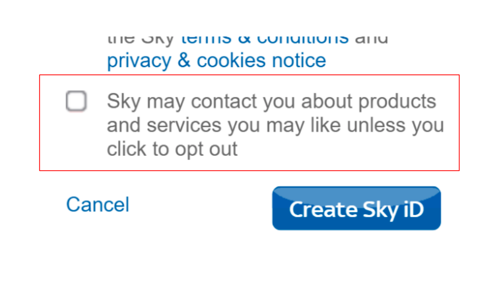
This entanglement is further enhanced by a call to action, which usually involves checking a box or agreeing to something. There is an amount of cognitive dissonance in responding positively to a negatively phrased action, which might bewilder the user enough to make him sign up for something that, if properly worded, would not have normally signed up for.
Checking (a positive action) to opt-out (a negative action) and, conversely, unchecking (a negative action) to opt-in (a positive action) is a perfect example of cognitive load applied to the user (Fig. 1).

Mobiversal’s advice:
- Use proper wording and phrases that are clear and concise, so that the user can easily understand the options he has available and what they mean
- Try to avoid using negation when formulating phrases
- Try to avoid any cognitive load on the user, by keeping the phrasing of the call to action and the available options both on the same positive way of wording (i.e. as opposed to the example in this section, Fig. 1.
- Corollary to step 3: Checking the box should be for agreement, unchecking it for disagreement.
Fake new notification
Initially, Facebook had its unseen notification bubbles in blue; it turned out that blue is not enough of an attention-grabbing color (it also did not help to use the same color as one of its primary colors), which made Facebook to purposefully change the bubbles to red: in order to better harvest user attention.
The color red is considered to be a trigger color, causing people to direct their attention to it, popping-out in the person’s field of vision. Most certainly, the contrast between Facebook’s primary color — blue — and the red of the bubble made the notifications pop-out in the user’s eyes.
Psychologically, red notification bubbles are the best insurance for businesses/services to make sure that users get to click on notifications. What is not such great insurance is abusing this knowledge, by using the fake new notification dark pattern.
Most notoriously, Facebook has provided users with fake new notifications, in order to click the Messenger icon to launch the application (Fig. 2). After clicking the icon, the users get redirected to the Messenger app, where they have no new chat or chat entry.
On a further note, sometimes the notification does not even disappear after clicking it. If users return to the app, the red bubble notification will still be there, even though they have clearly not received any new notification.

With some services, the same tactics apply, just that the reason for using it is to make sure users do an intended action, such as reading a notice from the service (Fig. 3).

In certain situations, this dark pattern can be unintentional, being caused by the malfunctioning of the notification system of the service.
Mobiversal’s advice:
- Make sure your notification system is working properly, in order to avoid falling in the fake new notification dark pattern, making sure your notifications are sent on time, without any duplicates.
- Although red is a trigger color, it is known to work in grabbing user attention and it has quickly become an industry standard. Implement it, if your palette of colors allows it, but do not abuse it.
Here at Mobiversal, we strongly believe in the concept of ethical design and creating rich and smooth user experiences, and we highly recommend taking note of the advice provided in this series when building your own software solutions. We hope you enjoyed it as much as we have and that you learned at least a thing or two about dark patterns 🙂
- Part I – Introduction
- Part II – Confirmshaming
- Part III – Disguised ads & Forced continuity
- Part IV – Friend Spam & Hidden Costs
- Part V – Misdirection, Price Comparison Prevention & Privacy Zuckering
- Part VI – Roach motel & Sneak into basket
- Part VII – Trick questions & Fake new notifications


